


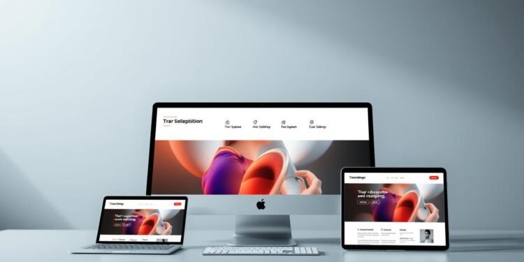
Have you ever wondered why some websites look stunning on every device, while others fall apart on smaller screens? The secret lies in responsive web design, a practice that ensures your site adapts seamlessly to any screen size. In today’s mobile-first world, this isn’t just a luxury—it’s a necessity.
Responsive design has evolved significantly since its inception in 2010. With over 50% of global web traffic coming from mobile devices, creating a mobile-friendly website is crucial for user engagement and SEO. Modern tools like Webflow have revolutionized the process, making it easier than ever to build dynamic, responsive pages without needing extensive coding knowledge.
This guide dives into the essentials of responsive design, from fluid grids and flexible images to advanced security features. Whether you’re a beginner or an experienced designer, you’ll discover practical strategies to create websites that look great and perform flawlessly on any device.
Key Takeaways
- Responsive design ensures your website adapts to all screen sizes.
- Mobile-friendly websites are essential for user engagement and SEO.
- Modern tools simplify the creation of dynamic, responsive pages.
- Fluid grids and flexible images are key components of responsive design.
- Advanced security features enhance website performance and reliability.
Understanding Responsive Web Design Principles
In a world dominated by mobile devices, responsive web design is no longer optional—it’s essential. This approach ensures your web content adapts seamlessly to any screen size, from desktops to smartphones. With over half of all web traffic coming from mobile devices, a responsive design is critical for user engagement and business success.
Why Responsive Design Matters in Today’s Digital World
Responsive design is more than just a trend—it’s a necessity. Users expect websites to load quickly and look great on any device. A poorly optimized site can lead to higher bounce rates and lost opportunities. For businesses, this means lower conversions and reduced revenue.
Search engines like Google also prioritize mobile-friendly sites, giving them a ranking boost. This makes responsive design a key factor in SEO strategy. By ensuring your site is accessible and visually appealing across devices, you can attract a broader audience and improve your online presence.
Key Principles and Best Practices
Creating a responsive website involves several core principles. Fluid grids and flexible images ensure layouts adjust proportionally to screen size. Media queries allow you to define breakpoints for different devices, tailoring the user experience.
Navigation is another critical element. Buttons and menus should be easy to tap on smaller screens, with a recommended size of around 48dp. Text readability is equally important—using relative units like percentages ensures it scales appropriately.
Testing is essential to identify and fix responsiveness issues. Tools like Webflow simplify this process, enabling you to create adaptive layouts without extensive coding. By following these best practices, you can build a site that delivers a seamless experience for every user.
Leveraging Webflow for Mobile-Friendly Websites
Building a website that works flawlessly on mobile devices is no longer a choice—it’s a must. With over half of global web traffic coming from smartphones, businesses need to prioritize mobile optimization to stay competitive. Webflow simplifies this process, offering tools that empower designers to create responsive layouts with ease.

Innovative Features and Unique Benefits
Webflow’s responsive grid system ensures your website adapts seamlessly to any screen size. Its built-in editor allows you to create tailored designs quickly, without extensive coding. Features like breakpoints and flexbox enable precise customization for different devices.
One of the standout benefits is Webflow’s image optimization. It automatically compresses and resizes images, enhancing loading speeds while maintaining quality. This is crucial for retaining mobile users who expect fast, smooth experiences.
For businesses, mobile optimization directly impacts growth. A well-designed, responsive website improves user engagement, reduces bounce rates, and boosts conversions. Webflow’s templates and features make it easy to create interactive, resourceful websites that meet these goals.
By leveraging Webflow, designers can focus on creativity while ensuring their websites perform flawlessly across devices. This not only enhances user experience but also strengthens your online presence in a mobile-first world.
Integrating AI and Advanced Tools into Your Workflow
The future of web design is here, and it’s powered by AI. With the rise of intelligent tools, designers and developers can now create smarter, more efficient workflows. AI integration is not just a trend—it’s a game-changer for building responsive and dynamic websites.
Exploring AI for Enhanced Design
AI-driven tools are revolutionizing the design process. They automate repetitive tasks, like layout recommendations and image optimization, freeing up time for creativity. For instance, AI can analyze user behavior to suggest design improvements, ensuring your web pages are both functional and visually appealing.
These tools also enhance personalization. By predicting user preferences, AI helps tailor content to individual visitors. This not only improves engagement but also boosts conversions for businesses.
Maximizing Efficiency with Integrated AI Apps
Integrating AI apps into your workflow can significantly improve efficiency. Tools like automated A/B testing and real-time analytics provide actionable insights, helping you optimize your site’s performance. AI-powered chatbots and content generators further streamline operations, making it easier to manage complex projects.
For developers, AI integration offers advanced features like automated code suggestions and debugging. This reduces errors and speeds up development, allowing teams to focus on innovation. With AI, the possibilities for creating smarter, faster, and more responsive websites are endless.
Designing Custom Templates and Content for Business Success
Custom templates and content are the backbone of a compelling digital experience. They not only reflect your brand identity but also ensure your website resonates with your audience. A well-designed template can captivate users, while tailored content supports your business objectives.

Strategies for Creating Stunning Website Templates
Start by understanding your audience and brand identity. A template should align with your vision while being visually appealing. Use a clean layout, intuitive navigation, and consistent color schemes to create a seamless user experience.
Incorporate responsive design principles to ensure your template works flawlessly on all devices. Tools like Webflow simplify this process, allowing you to focus on creativity. Test your design across different screen sizes to identify and fix any issues.
Custom content is equally important. Craft messages that speak directly to your audience, addressing their needs and pain points. Use storytelling to make your brand relatable and memorable. High-quality visuals and interactive elements can further enhance engagement.
Well-designed templates can significantly improve site performance and conversion rates. A visually appealing layout reduces bounce rates, while intuitive navigation keeps users engaged. By merging creativity with functionality, you can create a resource that drives business success.
For inspiration, explore case studies of successful websites. Analyze their design choices and content strategies to identify best practices. With the right approach, you can create templates and content that elevate your online presence and deliver measurable results.
Building Seamless Interactions with APIs and Integrations
APIs and integrations are the backbone of modern web functionality, enabling seamless interactions between platforms. They allow websites to connect with third-party tools, enhancing user experience and streamlining workflows. Whether you’re integrating payment systems or social media feeds, APIs play a crucial role in expanding your site’s capabilities.
Connecting Your Site with Essential Third-Party Tools
Developers can use native integrations and APIs to connect their sites with industry-leading tools. For example, payment processing APIs like Stripe enable secure transactions, while social media APIs allow for seamless content sharing. These integrations not only improve functionality but also enhance user engagement.
Marketing automation APIs can streamline email campaigns, while analytics APIs provide valuable insights into user behavior. By leveraging these tools, businesses can create a more dynamic and interactive page experience for their visitors.
Utilizing Developer Docs for a Smooth Setup
Properly utilizing developer documentation is key to a successful API integration. These resources provide step-by-step instructions, code snippets, and troubleshooting tips. Following best practices ensures a smooth setup and minimizes errors.
For instance, adhering to API provider guidelines helps maintain security and performance limits. Developers should also implement caching strategies to reduce API requests and optimize site speed. By mastering these techniques, you can create a more efficient and reliable web experience.
Effective API integration not only enhances site performance but also opens up new possibilities for innovation. With the right tools and knowledge, developers can build websites that are both functional and future-ready.
Scaling Your Website and Business with Secure Hosting
In today’s digital landscape, secure hosting is the foundation of a reliable and scalable online presence. It ensures your website performs seamlessly, even during traffic spikes, while protecting against cyber threats. For businesses, this means uninterrupted operations and enhanced user trust.
Optimizing Performance with Advanced Security Features
Secure hosting goes beyond uptime guarantees. Advanced features like automatic SSL/TLS encryption and global DDoS protection safeguard your website from vulnerabilities. These tools not only enhance security but also optimize speed, ensuring fast loading times for users worldwide.
Scalable hosting solutions adapt to your company’s growth. Whether you’re handling increased traffic or expanding your content library, these systems ensure your site remains responsive and efficient. This flexibility is crucial for maintaining a competitive edge in today’s fast-paced market.
Secure hosting also complements your design and template strategies. By integrating seamlessly with CMS platforms, it allows for efficient content management and updates. This collaboration ensures your site remains visually appealing and functionally robust.
Many companies have leveraged these features to maintain an uninterrupted online presence. For example, businesses using enterprise-grade hosting report 99.99% uptime, ensuring their users always have access to critical resources. By prioritizing secure hosting, you can build a resilient and scalable digital foundation for your business.
Enhancing User Experience with Advanced Membership and Web App Features
Creating a seamless user experience is key to retaining visitors and driving business growth. Advanced membership and web app features can transform how users interact with your site, making it more engaging and efficient.
Implementing Memberstack for User Accounts and Gated Content
Memberstack is a powerful tool for managing user accounts and gated content. It allows you to create secure membership areas, ensuring only authorized users can access specific resources. This feature is particularly useful for businesses offering premium content or services.
Setting up Memberstack is straightforward. You can integrate it with your website to enable user registration, login, and access control. Gated content can be customized to meet your business needs, providing a personalized experience for each user.
Streamlining Onboarding and Payment Integrations
Efficient onboarding and payment integrations are crucial for user satisfaction. Memberstack simplifies this process with multi-step onboarding flows and seamless payment processing. This reduces friction and helps users get started quickly.
Payment integrations support various methods, including credit cards and digital wallets. This flexibility ensures users can choose their preferred payment option, enhancing convenience and trust. For developers, these integrations are easy to set up, with clear documentation and support.
By leveraging these advanced features, businesses can improve customer retention and drive growth. A smooth user experience not only boosts engagement but also encourages repeat visits and conversions.
Conclusion
The digital landscape demands websites that adapt seamlessly to every device and user need. This guide has explored the essentials of responsive design, AI integrations, secure hosting, and membership platforms. These tools empower businesses to create scalable, user-friendly websites that drive engagement and growth.
Effective design, robust API integrations, and advanced security features are crucial for modern website success. By leveraging these strategies, you can build a website that not only looks great but also performs flawlessly. Whether you’re optimizing content or enhancing user experience, the right approach can transform your online presence.
Take the next step in your digital journey. Apply these insights to your projects and explore further resources to stay ahead in the competitive web design space. Your business deserves a website that stands out and delivers results.
FAQ
Why is responsive design important for modern websites?
Responsive design ensures your site looks great on all devices, improving user experience and boosting SEO rankings. It’s essential for reaching a wider audience in today’s mobile-first world.
What makes Webflow stand out for creating mobile-friendly websites?
Webflow offers innovative features like visual design tools, responsive templates, and seamless integrations, making it easier to build websites that adapt to any screen size.
How can AI tools enhance my website design process?
AI tools streamline tasks like content generation, layout optimization, and user behavior analysis, saving time and improving the overall quality of your site.
What are the benefits of using custom templates for my business website?
Custom templates allow you to create a unique, branded look while ensuring consistency across your site. They also save time by providing a ready-made structure for your content.
How do APIs and integrations improve website functionality?
APIs and integrations connect your site to third-party tools like payment gateways, analytics platforms, and CRM systems, enhancing its capabilities and user experience.
What security features should I look for in website hosting?
Look for features like SSL certificates, DDoS protection, and regular backups to ensure your site is secure, reliable, and performs well under heavy traffic.
How can membership features enhance user engagement on my site?
Membership features like gated content, user accounts, and payment integrations create personalized experiences, encouraging users to stay longer and engage more with your content.